Q3. What have you learned from your audience feedback?
After finishing our Trailer, Horror Poster and Horror Magazine front cover we needed to get some audience feedback. Audience feedback is an important part of our post production research, and to gain the most effective feedback on our products we posted our final products on Facebook, Weebly and twitter. Below is some feedback from friends regarding our trailer, magazine front cover and horror poster.
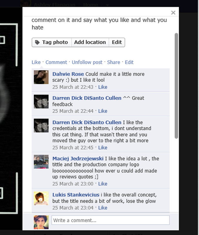
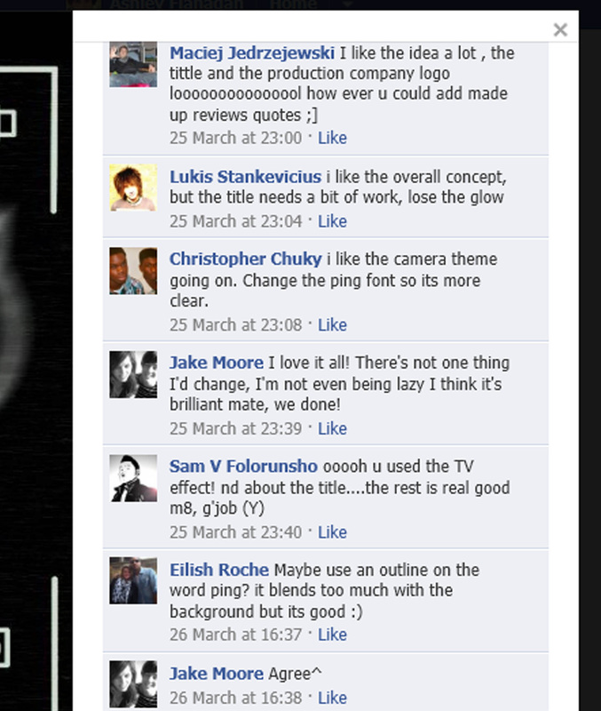
Horror Poster FeedBack

|
Once the final poster was made i posted our product on Facebook to get some feedback from people with their honest opinion. Our product did have positive feedback which was that people liked the use of font used for the credentials and the overall concept. Also since it was peoples honest opinion there were negative comments as well such as not understanding what the symbol was and why was it there and also little comments such as lose the glow around the title of the film and the colour of font used for the title. From the feedback given i think people did understand the products genre as the comment 'could make it a little more scary' was mentioned. This means that people understood what we were trying to acheive and what product genre it was but suggestions were made to guide to make a better horror poster as mentioned above. Based on the feed back given, what we could have done to make our product more effective was if given more time, i would fix the title of the of the trailer on the poster by changing the colour to red as this tie in with the horror genre and would connote blood and death. Also i would remove the glow as well as it won't be needed if the colour of the font was changed. Also looking back i would make a few of my own changes such as removing the black smudge behind the killers symbol.
|
|
|
Above is the feedback i obtained by posting my groups Poster on FaceBook
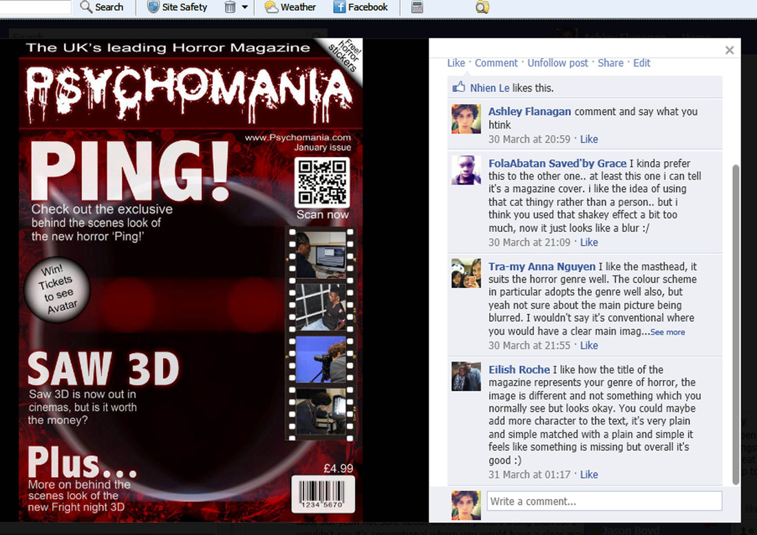
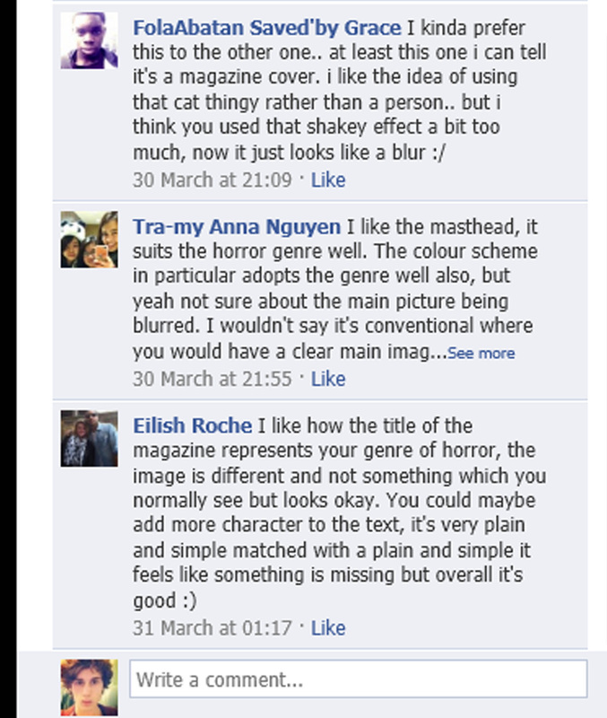
Magazine front cover feedback
|
Once the final magazine front cover was made i posted our product on Facebook to get some feedback from people with their honest opinion. The positive feedback about this product was that they liked the masthead since they thought it suited the horror genre well and also the colour scheme as well. The negative feedback mentioned was the main image was to blurred and the font used for the cover lines was to plain. From the feedback given i think that the audience did understand what the products genre was because the people who commented said that the masthead fitted the horror genre well therfore showing they understand what genre it belongs in. Also due to the use of blood splatters in the background it was easy to guess what genre our product would fall in to. Based on the feed back given, what we could have done to make our product more effective was if given more time, i would fix the main image by using less blur filters on the image making it more recognisable, also i would add more charater to the font by choosing a font such as copperplate gothic bold to really make the cover lines stand out to the audeince. Also i would make some personal changes as well i would try to fill it out more with more cover lines and also change the size of the price, date and website on the frontcover to much smaller size.
|
|
When using social networking to get feedback there is always the chance of people not liking what you have produced, and this can lead to silly comments being made by friends or random people and some silly comments have been made but this is problem of using social networks to get feedback.
|
|
