Q1. In what ways does your media product use, develop or challenge forms and conventions of real media products?
Magazine Coventions

|
  
|
As you can see from the layout of our magazines design compared to the professional ones above the layout is very similar and you can tell that we have followed a simple layout shown in most horror magazines.
|
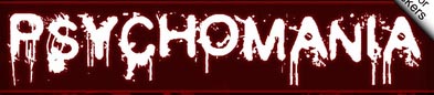
In most Horror magazines the masthead is bold and large and normally placed at the top of the magazine. Our magazine uses a unique splatter font and is quite large this is important because the masthead is what makes the magazine recognisable to the targeted audience.
The name of our masthead is 'Psychomania'. As a group we decided that this would be the most suitable name as ties in with our sub horrror genre and the name seems like it would grab the targeted audience attention. The masthead is the most common covention used in all magazine front covers, but we decided we will be orginal and make the mastehead look more grungy and dirty inspired by Creepy magazine masthead. We did this to acheive making it look more appealing and to make it seem like it belongs in the horror genre, also keeping the colour scheme the same by using red and white to help it stand out and also to connote death and blood. These are very stereotypical colours that are linked with the horror genre. The name of the font used was |

|

|

|
Another common convention used in most horror magazines is that there is a medium shot or a close up of the killer/moster/ main actor on the front cover looking out towards the audience. This is done to catch the eye of the targeted audience when they look through the magazine shelfs. Here some examples to the left. As you can see from 'SCARS' magazine, uses a medium close up shot of the killer covered in blood, the reason for this tells us that this character is very deadly and dangerous though the ridiculous amount blood used on the actor. When compared to our magazine we decided not show our killer so this would challenge the conventions of a horror magazine because we decided to use the killers symbol and not an actual image. The reason we used the symbol was because it has been consistant through out our products and by using it as the main image the audience will be able to recognise what it is ? and what film it is from?
|
|
Another convention used in our magazine front cover, is that all our cover lines are placed on the left side of the magazine. When doing our research on horror magazines we found out that most of magazines keep their cover lines to the left. An example of this is shown in the middle, for futher proof look above in at other magazine front pages you will see that cover lines on horror magazines are placed on the left side of the front cover.
|

|

|
|
Always in the Front cover of a magazine, there is a main cover line and most of the time the type of font used for the cover line is different from the fonts used on the magazine. A cover line would normally large and bold like the masthead so it stands out from the rest of the magazine.
To the right are some examples of Main cover lines and as you can see the purpose of them is to stand out and bring the attention of the audience to the magazine and try and encourage them to purchause it. However we chose not to follow part of this convention because we wanted to have it near the top of the magazine so it would be one of the first things the audience see's. Overall the the main cover line used the font that has been consistant through out our products so that the rest of our products can be seen as a package, therefore creating our own brand identity. |
   
|
Another convention we followed was the use of colours. Looking at most horror magazine they would have a limited colour pallet and use dark by effective colours such as purple, red, black or dark green as a background colour. Then use highlighting colours like white, yellow, bright green and red for cover lines. Compared to our magazine you will be able to see that we kept a limited colour pallet and kept a red white and black colour scheme. Using red to connote death and blood, using black to connote power and white to highlight the coverlines so they stand out from the colours.
