Q4: How did you use media technologies in the construction and research, planning and evaluation stages?
Movie Poster & Movie Magazine (Print Production/Advertising) Ashley
|
When starting to plan and design our movie poster and magazine front cover, we used the internet as our primary source of information to find exsiting movie posters and magazine front covers to follow the conventions used. The main aim was to look at how the layout was designed. What I learnt from the exisitng magazines like 'Empire' and 'Fangoria' is that the font used by branded magazines are normally used continuously.
|
Research into different magazines      |
Example of Photos TakenExample of Drafts |
Before our group could start producing any poster or magazine final products, we made 3 drafts for our poster and 3 drafts for the magazine frontcover. By doing this it made it the process of turining our ideas into practical photography sessions much quicker and made it run very smoothly. As a group we planned to spend an hour on taking photos for the first magazine idea. In this time we aquired a number of photos that could be used for the front cover and also we chose to spend that time outside of lessons so that we would be able to have priavcy and wouldn't be disturbed when taking images. This was done for the first design but in the end we changed our magazine design and ended up not using the images taken for the main image on the magazine but used the symbol we designed. We also spent the same time taking photos for the poster as well. The reason why we had a time limit was so that we could get started on designing and producing our front cover and poster quicker so we would have more time in creating them and gain feeback earlier so we had time to make changes if we had to. By planning the sessions it allowed us to have our costumes, lights and equipment already set up. During the session we took many pictures so we would have a good varity of images.
|
|
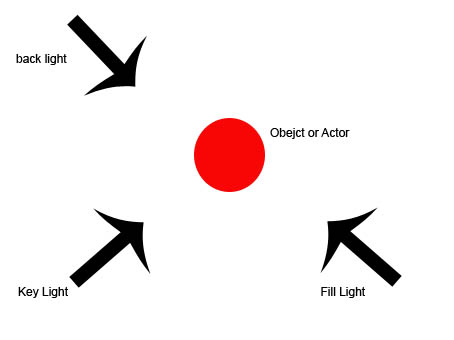
During Photographic sessions the positioning of the lights were directional. we wanted to have the key light to focus on the our actor, so we placed the light at an angle shining on the subjects face because we wanted to keep most of the image dark but we wanted to highlight certain parts of his face. During the session we tried different positions and different angles like having the light directly infront of the actor but made the actor appear really flat in the photo. experimenting with different positions allowed us to gain a vairty of images. If given the chance i would have tried to use three point lighting but to acheive what we wanted it wasnt needed. If we wanted to have three point lighting we would set it out like using the key light focusing on the actor then having the back light to help define the actor from its surroundings and then use a fill light to get rid of any unessassary shadows.
|
|

|
|
During our practical photography sessions we used the Bowens Flash Kit, which is a part of lighting equipment used when to take photos. The way the flash kit worked was that it would created a quick flash of artifical light once the photographer choose to take a photo upon click. In this session many photos were taken of our victim from the trailer for the first magazine we designed, during the process we had to play around with the settings of the flash kit on different photos to provide more light or less when a photo was taken, the reason for this was that some photos came out brighter than expected so by playing with the power of the light and the ISO on the Cannon 550D we was able to acheive the photos we wanted. The flash Kit was our main source of light and also we used EOS 550D Digital SLR Camera + EF-S 18-55mm Zoom lens to take our photos.

Bowens Flash Kit
|

EOS 550D Digital SLR Camera + EF-S 18-55mm Zoom lens
|

Photoshop
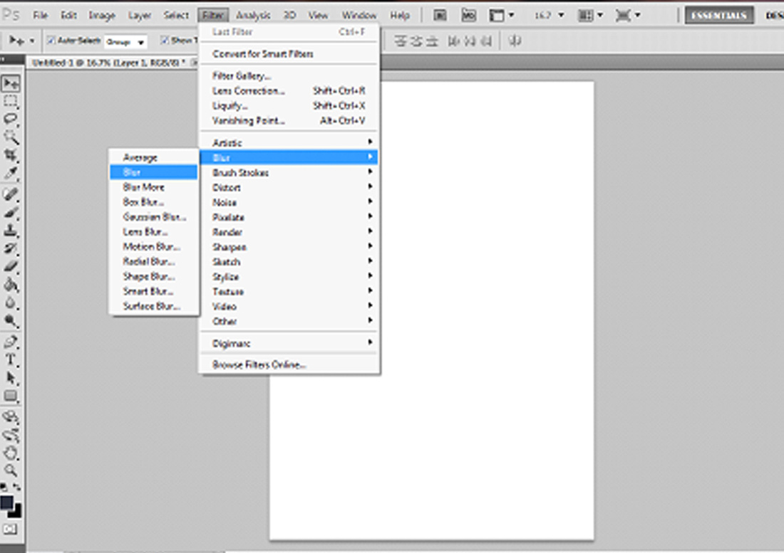
Screen Print of Filters used
|
When making our products the main image manipulation software used was Adobe Photoshop CS3 and CS5, this is a popular graphic/photo manipulation software. As a graphic and media student i already have the skills and knowledge of how Photoshop works. During the process of creating the poster and magazine front cover many problems occured such as freak problems like the magazine cover didnt save in the right format leaving us to start the magazine again. This became a problem but we resolved it by finding a early copy of the magazine which was half done and finished it off by adding certain tag lines and images.
Photoshop allowed the group to manipulate most things, such as changing brightness and contrasts of images, add new layers, use filters that can distort the chosen image such as motion blur, add text to the product and more. In our group most people owned photoshop at their homes so it was easily accessible and made work done quicker since we did most editing at home. |
|
In the process of advertising our magazine front cover and poster and also creating our products we used a more than one website to help us acheive our target. One of the websites that was used was FaceBook, we used this website to advertise our products and to gain feedback. This was a great way to gain realistic views about our magazine and poster because it gave poeple who weren't your friends to give honest opinions but there are also negatives as well which are your alowing your work to be public and this can give the chance for people to be inapporiate and make comments that could be offernsive or silly.
Another website that was used was Weebly, this is one of the main media technologies used as it is a website that allows the user to blog. This website was used constantly as we used to blog all our A2 coursework for our teachers to mark. |
     |
The last website we used was ffonts.net which allows the user to download many
types of fonts. In our poster we used a font named 'Steel Tongs' for our credits which was very useful and would use it again as it gave our poster a proffesional feel. Also Dafont was used to download a font called 'Nameless Harbour' this font was very sharp and fitted the horror genre and the reason for using this font was inspired by the magazine Creepy. I thought by using this font it would make it seem more of a horror magazine but from our feedback i was wrong and by doing more reseach i found out i could of used a more common font and if given the chance to do it again i would do this and follow the coventions of a horror magazine more. |
   |
While having a practical photography session with the lights and all different equipment set up around the room many healthy and safety issue that we had to be aware of. The main rule is not to have food and drink around the equipment as it can damage it and also cause harm to models used and to the people taking the photos. Another issue we have to be aware of is moving the equipment around as it can be heavy, the key lights can be very hot because they tend to burn up when left on to long and can burn someone if the lamp is touched. Also we had to take consideration of the basic rules such as watching where the wires lay as they can be a trip hazard. When taking photos we were very careful and not one was hurt at all during any of our photography session.
|
