Horror Poster: Final Destination 4
The horror poster I will be doing a analysis of is sequel to the Final destination series, Final destination 4. As well as it being the 4th film in the series, I was also the first film in the series to be shot and viewed on HD 3D. The film was released in the UK on the 28th August 2009. The film was directed by Hollywood director David R. Ellis, wsdho also directed the 2nd Final destination. There were two producers for the 4th film, Craig Perry and Warren Zide. It was distributed by New Line cinema and made by Zide/Perry Productions and live planet, also being another one of Mark Stevens Edited films.
The film includes known actors, such as Bobby Campo, Shantel Vansten and Mykelti Williamson. The film was supposed to end with Final destination 4, but due to great success of the film, Warner Bros decided to continue the sequel to 5, 6 and 7 for the Final destination series.
Final destination 4 is a thriller sub-genre and starts with Bobby having a premonition of a life threatening car crash, from this he convinces his friends to leave the area of the car race. Although a racist man; a mechanic; a mother and her children and a security guard followed them, which then saved their lives also. Although later on when the mother and the racist man a mysteriously killed, Bobby and his friends start to investigate the case further and try to break the chain of deadly events following them.
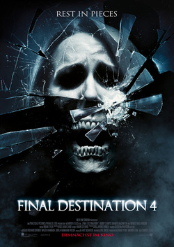
The Final destination poster includes a number of conventions. Such as it’s catchy tag line, ‘Rest in Pieces’ which is a play on phrase to the image of glass broken into pieces, with also an image of a skull in the background. This play on phrase is very effective and easy for the audience to understand.
The colors used in the poster are mainly very dark, they have used dark blue, black and white which color connotes mainly death (coming from a western world perspective, due to cultural differences). There is also a color connotation of power and elegance, coming from the amount of ‘black’ used in the poster. We could also say from an easterner’s point of view the white connotes a lot of death is included in the film.
This particular Final destination poster I believe could be a teaser poster, as there are credits of the production side of the film, but there is no indication of the film release, neither is there images or information on any actors starring in the film, which shows that this could have been released early in the movie campaign.
The presentation of the font title is very bold and striking to its reader’s eyes. This comes from the fonts bright white glow, which we can see is deliberate, when in contrast to the ‘Rest In Pieces’ font. Furthermore both fonts used in the poster are sans serif fonts, which connotes are more serous feel about the movie. Moreover the poster not having any actors names or a film release date, we can say that they are trying the sell the title of the film, due to being a series in the sequel.
The presentation of the poster in a general sense, looks as if it was completely made digitally on Photo-shop, with the use of a two main photos of props, such as the skull and broken glass. An example of the poster being digitally made in Photo-shop can be the ‘smoke’ background, which can be made with the use of the brush tool.
The poster itself conveys a very dark and mischievous mood. This mainly comes from the dark colors and the broken skull, which also looks as if it is screaming. From this screaming we can also say that it’s the result of the broken glass, due to when people’s high pitch noise can eventually shatter glass. Although because this is a skull we would have to say that before the person died they were screaming in fear.
In conclusion I believe this poster is very effective to the audience as a teaser poster. With the great use of Photo-shop techniques, they were able to make the poster connote mystery, fear and death. Selling the film itself a lot by just the use of the image and the creative tag-line, which makes the poster very catching. Overall the tone of horror is set effectively throughout the poster’s image and also seriousness through the poster’s font.
The film includes known actors, such as Bobby Campo, Shantel Vansten and Mykelti Williamson. The film was supposed to end with Final destination 4, but due to great success of the film, Warner Bros decided to continue the sequel to 5, 6 and 7 for the Final destination series.
Final destination 4 is a thriller sub-genre and starts with Bobby having a premonition of a life threatening car crash, from this he convinces his friends to leave the area of the car race. Although a racist man; a mechanic; a mother and her children and a security guard followed them, which then saved their lives also. Although later on when the mother and the racist man a mysteriously killed, Bobby and his friends start to investigate the case further and try to break the chain of deadly events following them.
The Final destination poster includes a number of conventions. Such as it’s catchy tag line, ‘Rest in Pieces’ which is a play on phrase to the image of glass broken into pieces, with also an image of a skull in the background. This play on phrase is very effective and easy for the audience to understand.
The colors used in the poster are mainly very dark, they have used dark blue, black and white which color connotes mainly death (coming from a western world perspective, due to cultural differences). There is also a color connotation of power and elegance, coming from the amount of ‘black’ used in the poster. We could also say from an easterner’s point of view the white connotes a lot of death is included in the film.
This particular Final destination poster I believe could be a teaser poster, as there are credits of the production side of the film, but there is no indication of the film release, neither is there images or information on any actors starring in the film, which shows that this could have been released early in the movie campaign.
The presentation of the font title is very bold and striking to its reader’s eyes. This comes from the fonts bright white glow, which we can see is deliberate, when in contrast to the ‘Rest In Pieces’ font. Furthermore both fonts used in the poster are sans serif fonts, which connotes are more serous feel about the movie. Moreover the poster not having any actors names or a film release date, we can say that they are trying the sell the title of the film, due to being a series in the sequel.
The presentation of the poster in a general sense, looks as if it was completely made digitally on Photo-shop, with the use of a two main photos of props, such as the skull and broken glass. An example of the poster being digitally made in Photo-shop can be the ‘smoke’ background, which can be made with the use of the brush tool.
The poster itself conveys a very dark and mischievous mood. This mainly comes from the dark colors and the broken skull, which also looks as if it is screaming. From this screaming we can also say that it’s the result of the broken glass, due to when people’s high pitch noise can eventually shatter glass. Although because this is a skull we would have to say that before the person died they were screaming in fear.
In conclusion I believe this poster is very effective to the audience as a teaser poster. With the great use of Photo-shop techniques, they were able to make the poster connote mystery, fear and death. Selling the film itself a lot by just the use of the image and the creative tag-line, which makes the poster very catching. Overall the tone of horror is set effectively throughout the poster’s image and also seriousness through the poster’s font.
