Textual Analysis: Horror Poster
The film Poster that I will be analysing is ‘Shutter (2008)’. Shutter is a 2008 American remake of the 2004 Thai horror film of the same name. The remake was directed by Masayuki Ochiai, and was released on March 21, 2008. Masayuki Ochiai also directed Infection a Japanese horror/ drama film that is about an ‘INFECTION’ takes place in a dark, isolated hospital, where one doctor’s mistake has led to dire consequences for a patient. The film includes such actor’s as Joshua Jackson, Rachael Taylor and James Kyson. This film has had a bad rap many reviewers have said this film is “It's all rather predictable and often irritatingly derivative” The BBFC thought that this film was fine and gave a certificate of 15 and no cuts were made to this J-Horror film.
Shutter is about a newly married couple discovers disturbing, ghostly images in photographs they develop after a tragic accident. Fearing the manifestations may be connected; they investigate and learn that some mysteries are better left unsolved.
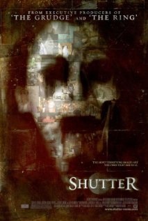
As one can see the poster reveals details of the film for example, “from the producers of the ‘Grudge’ and ‘The Ring’”. The reason for this to show the audience that there is a possible chance that the film will be good since it tells you that the producers have filmed other successful films like the ‘Grudge’ and ‘The Ring’. Furthermore the design of the ‘Shutter’ poster includes a collage of screen grabs from the film itself. This was done to ensure that anything can be captured on camera even ghost which hints what the film is about and wanted ensure that film could come across as freighting and unnatural through the public eye.
The ‘Shutter’ poster gives off a very grungy, dark and unnatural feeling. This is done through excellent use of low and high key lighting and also use of colour and collage, thus connoting darkness which most horror films use in their films as it’s a way to implement fear. The use of dark eerie and urban colours contribute to the grunge theme that has been used in the poster and the colour red would connote blood which means suffering would be involved as well. The use of the colour black would connote evil and death and this would tie in with the film since people suffer, die and there is some form of evil that is meant to torment the couple within the film.
The focus point in the poster is the image of a ghostly looking face with a pale white used to colour the face, and this would connote death but only in some Asian countries. It relates back to the characters used in J-Horror films for example in ‘The Ring’ the girl with pale white skin was a spirit set to kill who ever watched the tape. Also in the ‘Grudge’ they used a boy and a girl with pale white skin who killed as well. As you can see that in a Japanese horror film white would connote death.
In the poster it uses a catchy tag line “The most terrifying images are the ones that are real” is a short phrase to relate to the film. This is helps promote the film as it relates to the idea of supernatural spirits being captured in a picture which is used in the film. The tagline portrays how terrifying the film will be, scaring the audience and making them want to see the film.
The typeface in the poster fits the horror genre effectively and I think has taken inspiration from other films like the ‘Saw’ posters. The sharpness of the lettering could represent the sharpness of a picture taken with a camera which ties in the film because it’s all about discovering a dark and mysterious secret within the photos that were taken. Furthermore, the size of the font used on the title of the poster is quite large and the reason for this is that they are trying to promote the name of the film as much as possible so that people will remember the name and go buy or view the film. The dark, grungy background that is used helps the font stand out since the colour of the font is white, showing the contrasting colours helping the title of the film stand out.
To conclude, I believe this poster was very effective and was able to stand out to its targeted audience. The excellent use of Photoshop skills has allowed the poster to connote mystery, death and fear through the colours and the theme of the poster. The clever use of the tagline and promotional techniques and little lighting used within the poster has helped to create an unnatural atmosphere. The use of image helped sell the idea of this film was about supernatural beings.
Shutter is about a newly married couple discovers disturbing, ghostly images in photographs they develop after a tragic accident. Fearing the manifestations may be connected; they investigate and learn that some mysteries are better left unsolved.
As one can see the poster reveals details of the film for example, “from the producers of the ‘Grudge’ and ‘The Ring’”. The reason for this to show the audience that there is a possible chance that the film will be good since it tells you that the producers have filmed other successful films like the ‘Grudge’ and ‘The Ring’. Furthermore the design of the ‘Shutter’ poster includes a collage of screen grabs from the film itself. This was done to ensure that anything can be captured on camera even ghost which hints what the film is about and wanted ensure that film could come across as freighting and unnatural through the public eye.
The ‘Shutter’ poster gives off a very grungy, dark and unnatural feeling. This is done through excellent use of low and high key lighting and also use of colour and collage, thus connoting darkness which most horror films use in their films as it’s a way to implement fear. The use of dark eerie and urban colours contribute to the grunge theme that has been used in the poster and the colour red would connote blood which means suffering would be involved as well. The use of the colour black would connote evil and death and this would tie in with the film since people suffer, die and there is some form of evil that is meant to torment the couple within the film.
The focus point in the poster is the image of a ghostly looking face with a pale white used to colour the face, and this would connote death but only in some Asian countries. It relates back to the characters used in J-Horror films for example in ‘The Ring’ the girl with pale white skin was a spirit set to kill who ever watched the tape. Also in the ‘Grudge’ they used a boy and a girl with pale white skin who killed as well. As you can see that in a Japanese horror film white would connote death.
In the poster it uses a catchy tag line “The most terrifying images are the ones that are real” is a short phrase to relate to the film. This is helps promote the film as it relates to the idea of supernatural spirits being captured in a picture which is used in the film. The tagline portrays how terrifying the film will be, scaring the audience and making them want to see the film.
The typeface in the poster fits the horror genre effectively and I think has taken inspiration from other films like the ‘Saw’ posters. The sharpness of the lettering could represent the sharpness of a picture taken with a camera which ties in the film because it’s all about discovering a dark and mysterious secret within the photos that were taken. Furthermore, the size of the font used on the title of the poster is quite large and the reason for this is that they are trying to promote the name of the film as much as possible so that people will remember the name and go buy or view the film. The dark, grungy background that is used helps the font stand out since the colour of the font is white, showing the contrasting colours helping the title of the film stand out.
To conclude, I believe this poster was very effective and was able to stand out to its targeted audience. The excellent use of Photoshop skills has allowed the poster to connote mystery, death and fear through the colours and the theme of the poster. The clever use of the tagline and promotional techniques and little lighting used within the poster has helped to create an unnatural atmosphere. The use of image helped sell the idea of this film was about supernatural beings.
