Q1. In what ways does your media product use, develop or challenge forms and conventions of real media products?
While planning, shooting and editing our video a lot of thought was put into what conventions would be followed and which conventions should be challenged. If no conventions are followed there is a risk of creating a complete disassociation with the genre, they're conventions for a reason. However if all conventions are followed the product will be very generic and audiences will pass it off as "just another horror film". Finding an appropriate blend of conventions to follow and challenge is essential in creating a unique and enticing product.
Convention Followed/Challenged Reason Example
|
Dark setting
Minimal info revealed Killer's identity is hidden Action Voiceover Sound effects Music Captions Editing/Shots |
Followed
Followed Followed Challenged Challenged Followed Developed Followed Followed |
It seemed foolish to ignore the well established convention of darkness in horror trailers. While researching horror trailers virtually all them utilized low key lighting and a generally dark atmosphere to great effect. People tend to be more scared in the dark, and seeing as the purpose of a horror film is to scare it made sense to create a dark atmosphere. A dark atmosphere is vital when attempting to evoke a sense of mystery and helps immerse the audience in the film.
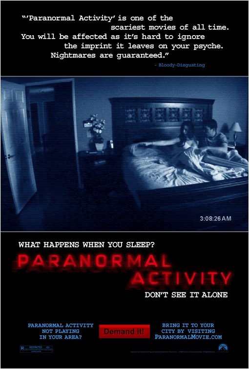
The whole purpose of a teaser trailer is to raise more questions than it answers. Once people watch a teaser trailer the ideal reaction would be for them to start asking questions and contemplating the story-line. We decided to follow the convention of an implied killer, meaning at no point did we reveal his identity. This aids in "teasing" the audience and generates hype over the film - fueling the anticipation leading up to it's release. The idea of hiding the identity of the killer dates back to Alfred Hitchcock's Psycho and has continued to be a key element in horror films. It could be argued that people go to watch horror films to answer the questions raised in the teaser trailer as opposed to going simply to get scared - hence the importance of revealing as little information as possible. Many of the most successful horror franchises of all time conceal the appearance of the killer throughout the film; this has especially become synonymous with Slasher films (Scream, Friday the 13th to name a few). The mask in Scream allows the audience to play a constant guessing game, trying to figure out who the murderer is. In the vast majority of horror trailer there is some element of action, be it in the form of blood, violence, props/weapons, paranormal activity or screams towards the end. We decided omit these staples in our trailer in order retain some originality. Our trailer primarily focuses on psychological fear a and i feel this can be achieved without the excessive use of ghosts or screams. We hoped that creating a horror trailer that doesn't rely on chiché screams or violence would make it stand out from the countless others that do - such as the Paranormal Activity 3 trailer (scream at 1.14). There is no spoken dialouge in our teaser trailer whatsoever. Instead, throughout the trailer we placed a range of sound effects and music. While voiceovers may help the audience understand the film and the characters a little better, we felt it detracts from the atmosphere. While the audience may not have information as to why our victim has been - neither does this victim, thus helping the audience identify with our victim. We followed the sound effect convention set by films that give the illusion they are being filmed by a camcorder (such as REC). These types of sound effects sound very much like static or a glitched camera. Furthermore they give the impression that the audience are genuinely watching CCTV footage and immerses them further in the trailer. While following the classic convention found in many famous horror films of using a score played on the piano, we attempted to infuse elements of newer horror trailers by overlaying the score with the aforementioned sound effects. The score differentiates our trailer from others such as Rec, as we were highly inspired by the Rec trailer we felt it was key to set ours apart. Moreover, a score helps create a brand identity and more importantly creates ambiance. One great example of a score that establishes a firm brand identity and creates the perfect ambiance is the Halloween score. Captions were added to our video in order to give a little backing information on Blackberries, as the use of Blackberries play such a large role in our film. Considering we omitted any kind of voice-over, we needed some way of illustrating the story-line to our audience. Seeing as our trailer is under a minute long, the teaser trailer convention of quick cuts made the most sense. Quick cuts also create tension and suspense, two crucial elements in teaser trailers. Another convention found in many horror trailers is incorporating a few elongated shots so that audience have an opportunity to observe what is being shown. Reaction shots are commonly found in horror trailers, giving the audience a sense of the terror the victim goes through - hence our inclusion of numerous reaction shots. We gathered inspiration for our editing from numerous trailers, notably the "Buried" trailer. We felt the editing combined with captions paced the trailer perfectly and went well with the nature of our film. |
(Below) An example of a horror trailer voiceover
|
The posters
In regards to horror movie posters, production companies tend to go for either a simple teaser poster that shows the film's logo or a more elaborate poster that shows more of the film.

|

|
|
Initially we drafted a simple teaser poster with the Ping!
logo, however, this form of poster is usually most effective when a strong brand identity has been established. Teaser posters work because fans will it and immediatelty recognise it - through either the logo, the colours or the typography (emphasizing the importance of continuity). We strictly followed the conventions of teaser posters as not much variation is seen throughout the world of horror teaser posters. As with many other teaser posters, ours is predominantly black with some red. The colours black and red and synonymous with the horror genre - connoting fear and death. Another key convention in teaser posters is that no actors are seen, focusing on the fact it is merely "teasing". Teaser posters serve simply to inform the public that the film has been announced; occasionally it was reveal the release date. Seeing as the conventions of teaser posters are very rigid, we saw no need to develop conventions, hence the reason the poster only shows: The logo The title "COMING SOON" Production company name Producer credits |
|

|
Taking into account we have not yet established a strong brand identity, a second poster was made that depicted the film better than our teaser. We also tried to follow as many conventions as deemed appropriate as conventions appear to be more important in posters than they are in trailers. This could be because audiences tend to get to better feel of the film from a trailer as opposed to a poster. A convention commonly found is that the poster is comprised of an image that represents the film and especially it's genre. Seeing as conventions are essentially what defines a genre, thus why we attempted to capture the mis en scene of Psychological/Paranormal horror posters. This was achieved by ensuring we included a tagline and creating a specific typography that heavily relates to the film. For example, in the "Scream" poster the writing is very slick and sharp - much like the blade used by the murderer. As is the case with Ping!, the typography is similar to that found when genuinely sending a "Ping". However our film also has paranormal elements to it, so a corresponding glow was placed beneath the text.
|

Example of typography that is representative of the text
|
|

