Textual Analysis on magazine font cover
Empire is a British film magazine, which is published by one of the famously known German publishing company, Bauer Consumer Media. It is also the biggest selling film magazine in Britain, outselling main competitors such as Total Film, a film magazine published in Australia, Turkey, Russia and Portugal. Empire is a monthly magazine which mostly in consumed by subscribers.
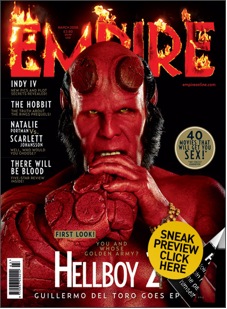
In terms of the magazine’s main image, the designers have decided to make a medium close up of the model. The model has an aggressive non-verbal communication; we see this from the clenching of the fist and the squinting of eyes, which connotes that the character is expressing its anger which is a hint and representation on how he’s presented in the film. The red also colour connotes the characters anger and aggression in the image. As the colour connotations of dark red are anger, rage and danger, which is represented in the Empire logo design with fire around the font, which connates hell, hence why i beilieve they used fire as a good link to represent the film 'Hell' boy. Red also connotes blood, which is shown through the characters shading of red, which is a ‘blood-red’ colour, which connotes a much more negative side to the colour, associations such as war and violence. The colour connotation of red is also a universal sign of warning and danger, also showing anger and aggressiveness.
In addition the ‘yellow’ eye colour of the model also connote in a negative context, a non-emotional character, which can be a stereotypical impression of the character, especially from the physical aggressiveness of the models non verbal communication. Moreover the ‘dark green’ is associated with greed and jealously. In addition to this the model squints with his eyes, which maximizes its eye contact with its audience while being on the shelf of stores.
The image in contrast to the layout of the magazine is quite bold and brought to the front of the magazine, overlaying the Masthead logo. This brings maximizes the models image on the front cover and allows the image to stand out to its audience while being on the shelf of stores. Also due to the magazine being extremely popular in the UK, covering the masthead doesn’t make it as much of a poor design, as its target audience will still notice it. On the other hand in terms of a structured layout having the main image cover the masthead makes the design less effective and also a drawback in terms of the left third. As the image makes it less visible for the readers to notice the magazine, while on display next to all the other competitors.
In addition to this the masthead is completely in Sans serif fonts, which connote the magazine keeping current to the present day in age of our modern society. They also include the magazine website address just under the masthead, in a relatively small font size, which connotes that their main objectives with the front cover is not try to sell, or ‘show off’ the magazines website as much. Furthermore the dateline is also include within the masthead, although collectively with the website address, all three have been incorporated together and laid out modestly. This particular magazine was released in March 2008, although it being a monthly magazine, it will usually be on the shelf stores a whole month before the cover date.
In terms of lighting, we can see there was lighting coming from both side of the model, we see this from the flash spots on either side of the models face and also from the top of the models hand. In addition to this the models costume is very unique and very detail as the models face being completely symmetrical, on the other hand the characters hands are asymmetrical, this appearance is mainly due to the character built for the film.
In conclusion I believe this magazine is very effective to the audience its audience. With the great use of Photo-shop techniques, using a good relationship
in colours between the Model and the masthead, the colour conations of dark red gives the audience connotations of danger, anger and rage. I believe the effectiveness of this, was the unique selling point of the magazine as it made the poster very eye catching. Overall the tone of magazine is set effectively throughout the magazine image.
