Q2. How effective is the combination of your main product and ancillary texts?
Brand Identity/Continuity
(Brand identity is when your targeted audience is able to recognise all your products are linked and seen as a part of a package.)
|
When creating the our main product and our ancillary texts, our main aim was to show continuity through our products so that each product designed are linked and making them all part of the same package giving its own identity which can be easily recognised by the targeted audience. We found out this could be done through the form of typography used with in the trailer, poster and magazine and also through the use production design e.g images or the range od colours usedor symbol used. A good example of continuity used would be the film Scream as it
has many coventions as it uses the same colours and the same form typography on its posters. |

|

|
|
Though our planning and researching and audience feedback stages of our project we spoke to many people about what they would like to see and they dislike about horror films and our products, and one thing that was never brought up was the consistency of product as we thought there other more important aspects we should focus on. Brand indentity is what helps sells products and sometimes its not needed because some people want it as it can be a necessity for them. For our product package, being non existent as our product has been made not for earning purposes, we had to find a way of promoting our products without using Brand Identity. When it comes to promoting there are many different types of media that is avalible for us to use such as Tv, Radio, Posters and Newspaper ads but the main media that we are going to use will be the internet. The reason why we are using the internet is because it is forever growing, its fast and quick to use by the people who we are aiming our products at, hoping the more our products are seen a link will be seen by the targeted audience creating our own brand identity which will then lead to high sales of the film after seeing the teaser trailer by us Psyhcoactive Productions.
|
|
|
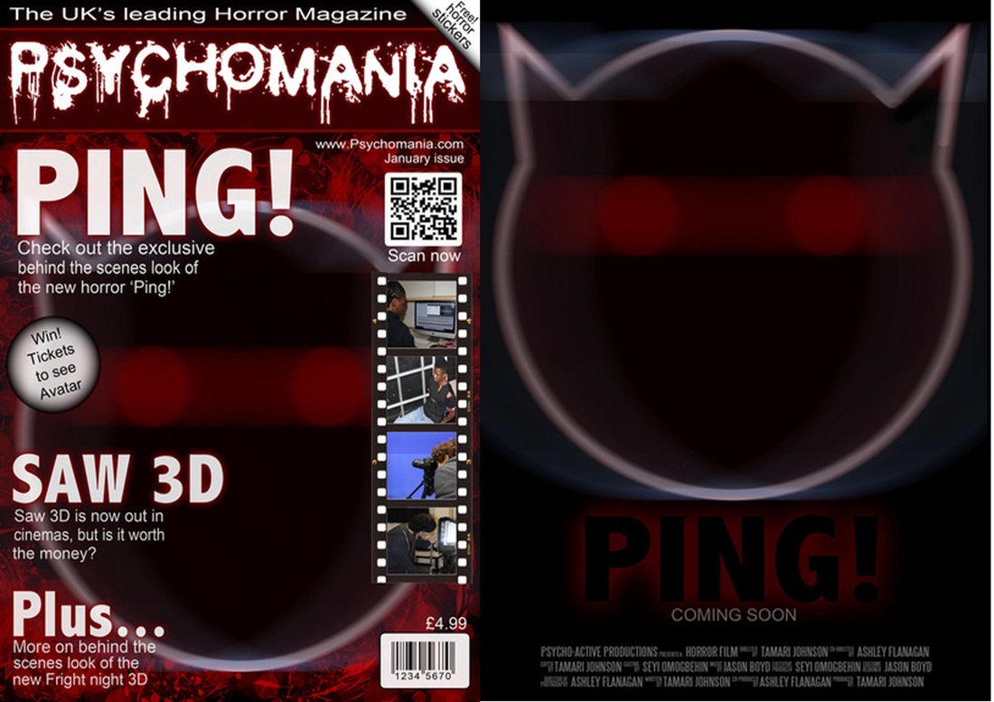
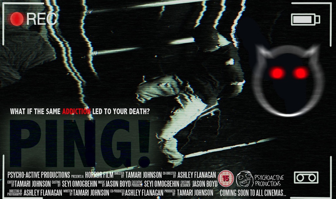
Psyhcoactive Productions is our production company. Our comapny only focuses on one genre of horror which can be seen throught the design of the logo and the prouctions company name. The company logo is used constantly through our products except for the magazine front cover because we as a group thought it didn't seem like a place for the productions company name to go but through more research into this i found out that by placing the comapany's logo on to the magazine it could improve on the brands identity. Since our company has such a low budget we thought the best inspiration for us would be Paranormal Activity production company since they had a low budget as well but still was able to create a highly popular horror film that made a massive impact on it's audience. 'Ping!' is a psyhcological film and we think will be a massive hit with fans of Paranormal Activity as they both share the ruged hand held camera effect to give a sense of reality to the film.
|
|
'Ping' is the name of our film and it connotes a very alerting tone as it is the sound which the phone makes when a message has been sent to the phone which then identifys the film to be an orignal, modern and alerting film. The title shows some insight to what the films mainly about but also at the same time can leave the audience wondering what it could be about. From the being stages of making our teaser trailer we decided that we should keep the tension and mystery in the trailer and we did this by not showing the killer at all except for a close up shot of the killer trying to communicate with victim through the BlackBerry which then goes Ping which alerts the victim, which starts building the tension but also keeping the identity of the killer a mystery.
|
|
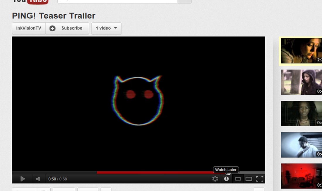
For us to have some form of brand identity we had to be consistent through each of our products. We have mainted this by the use of the killers symbol, and was used in the magazine, poster and teaser trailer. The symbol is very simple but effective, and can be easily remembered once seen for the first time. This is the effect we wish to acheive, we wanted a simple symbol as soon as released people can relate it back to the film and by keeping it consistently through our products it creates a link between showing they are all from the same package. The symbol is of emoticon commonly used by blackberry users by has been modified to meet the horror genres coventions by adding horns smybolising that it is devilish, also the colours are red which would connotes blood and could symbolise death so that it ties in with the horror genre. It also uses black as well and this would connote death, mystery and power which all ties in with the theme of the film which we are trying to display through our symbol. This symbol is very similar to the Dark Knight campaign as we both used a unique symbol to draw in the audience by leaving them clueless about what the symbol means and letting them do research on it. Even though 'Ping' is a horror film and the Dark Knight is of an action/adventure genre the campaign used was very successful and which inspired us as group to use the same method of marketing.
|
|
|
|
Another successful aspect we kept consistent through our products was the font used. The name of the font was 'Abadi MT Condensed Ex' is a very plain but bold style of font which is used in all products. Although the postioning and size of font could have been more consistent, the Title has all been the same font keeping to the coventions of a horror, poster, magazine and teaser trailer . As there is always room for improvement i think we could have improved on the layering of text in poster and magazine to make them more neater. Also the colour pallet used in the design of the poster and magazine has been kept consistant, with the constant use of black, red and white. The black was used to connote death so it would tie in with the horror coventions in a magazine and poster, the red was used to connote blood which also meets the coventions used in a horror magazine and poster and then white used to connote madness. All of these connatations were planned to be used so they would meet the coventions of the horror genre.
|
|
When the process of making the teaser trailer began it become the last of our products to be finsihed. When it came to filming we didn't start till late due to poor use of time and if done again we would have filmed near the begining of the product as we realised that how hard the task was but as group we decided that this was our most effective product but many things could have been changed. As the design process went on, we ended up making the products at the same time, as it was easier to focus on the poster and magazine first as they were simple and straight forward tasks. One of the things we would have changed is making sure everyone knew how to use the software as it slowed the process of the teaser trailer down since only one person could have worked on it. Also by spending many weeks playing around with Final Cut pro new idea's came to mind and made use constantly mess around with our teaser trailer which dragged it out till it was the last product to be made. In the end we decided we should stick with our story board plus with a few changes. Overall since the teaser trailer was the biggest product of our campaign we should have spent more time and should have developed our knowledge on the software used to make a better teaser trailer but from audieince feedback and our own personal opinion we believe that our teaser was most successful, and if given the chance to do this again i would make sure all the points made were covered.
|
The least effective of our products was the magazine front cover, it was an original idea and after completing it was disappointing to see a such a weak outcome for a group with two experinced photoshop users. The problem was that we spent little time planning and making the poster, since most of our time was focused on the teaser trailer. So if given the chance to start again i would take the lead and start designing and planning earlier to use our photoshop skills to fullest. In the magazines design there was no major problem but many small problems like the web address was to large and so was the price, to fix this i would make them smaller by scalling them down. Also more headlines and tag lines could have been used to fill out the front cover as it looks a bit empty but overall we are pleased with what we have but if given time changes would have been made.
