Magazine front cover: Empire Magazine
Empire a British film magazine published once a month by
the Bauer Consumer Media which is a large German publishing company and is based
in 15 countries worldwide. Empire magazine is one of the largest selling film
magazines within Britain. Below Empire magazine is Total Film magazine which is
one of the main competitors for Empire magazine which is published in Australia.
Empire magazine is normally bought by subscribers.
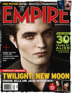
The main image on the front cover of Empires Twilight Edition is
a medium close up of actor Robert Pattinson who plays Edward Cullen in the film
Twilight. The pose used has a very serious non-verbal communication; we can see
from his facial expression that he trying to show an emotionless look while
still trying to be presented as a very serious character as he is in the film.
The colour of the actor’s skin is very pale which connotes the actor to be
lifeless which is done on purpose because the actor’s character in the film is
vampire. In addition the yellow eye colour of the actor connotes that the actor
is something inhuman, unrealistic and fierce. Also the way the model is posed in
a certain way to attract their target audience to buy the magazine as Robert
Pattinson is seen as an attractive male by most females which could boost the
sales of the magazine.
It uses lighting to great effect using lighting from a certain
angle to provide light to the left of his face creating a good contrast of light
and dark in the image, which may connote that there are two sides to the person
good and bad. Also the use of the black background helps the image stand out
because the colour black used is very strong and it’s not very busy.
The masthead in Empire magazine overlays the main image
on the magazine standing out from the rest of the magazine making sure that it
is the centre of attention and this was done as promotional technique so it
would stand out when on the shelf’s. Even if the layout of the magazine made
the masthead slightly hidden behind the image it wouldn’t matter because Empire
magazine is already highly recognisable because of how popular they are.
The masthead was written in the colour red to connote blood and
this was done by the designer because the magazines main focus is on the film
twilight which has vampires which creates a link between the colour used and the
film. Also around the mast head it has it has a white border to contrast the red
lettering to help the masthead stand out more.
On the front cover there are many headlines explaining what will
be featured in the magazine and each one has a different colour such as yellow
and green to highlight important information that would attract the target
audience to the magazine.
the Bauer Consumer Media which is a large German publishing company and is based
in 15 countries worldwide. Empire magazine is one of the largest selling film
magazines within Britain. Below Empire magazine is Total Film magazine which is
one of the main competitors for Empire magazine which is published in Australia.
Empire magazine is normally bought by subscribers.
The main image on the front cover of Empires Twilight Edition is
a medium close up of actor Robert Pattinson who plays Edward Cullen in the film
Twilight. The pose used has a very serious non-verbal communication; we can see
from his facial expression that he trying to show an emotionless look while
still trying to be presented as a very serious character as he is in the film.
The colour of the actor’s skin is very pale which connotes the actor to be
lifeless which is done on purpose because the actor’s character in the film is
vampire. In addition the yellow eye colour of the actor connotes that the actor
is something inhuman, unrealistic and fierce. Also the way the model is posed in
a certain way to attract their target audience to buy the magazine as Robert
Pattinson is seen as an attractive male by most females which could boost the
sales of the magazine.
It uses lighting to great effect using lighting from a certain
angle to provide light to the left of his face creating a good contrast of light
and dark in the image, which may connote that there are two sides to the person
good and bad. Also the use of the black background helps the image stand out
because the colour black used is very strong and it’s not very busy.
The masthead in Empire magazine overlays the main image
on the magazine standing out from the rest of the magazine making sure that it
is the centre of attention and this was done as promotional technique so it
would stand out when on the shelf’s. Even if the layout of the magazine made
the masthead slightly hidden behind the image it wouldn’t matter because Empire
magazine is already highly recognisable because of how popular they are.
The masthead was written in the colour red to connote blood and
this was done by the designer because the magazines main focus is on the film
twilight which has vampires which creates a link between the colour used and the
film. Also around the mast head it has it has a white border to contrast the red
lettering to help the masthead stand out more.
On the front cover there are many headlines explaining what will
be featured in the magazine and each one has a different colour such as yellow
and green to highlight important information that would attract the target
audience to the magazine.
